Tag Archives: exhibition lighting

Tiffany: Vision & Virtuosity at the Saatchi Gallery


Our latest project for Tiffany, the Vision & Virtuosity exhibition, or ‘a journey through 185 years of innovation, craftsmanship and heritage’ has opened at the Saatchi Gallery on London’s King’s Road.

The exhibition is a magnificent tour of Tiffany’s history, showcasing not only the in-house jewellery skills that have made them justly famous worldwide, but also the remarkable collaborations with other designers and creators that has kept them at the forefront of creativity since they were founded in New York in 1837.

With over 400 objects and seven exhibition sections to explore, the exhibition really does showcase the incredible range of craftsmanship the company has produced – not only in diamond jewellery, but in silverware & of course, iconic Tiffany lamps.

DHA worked with the set designers, Agence NC & video designers, La Meduse to produce seven very different rooms, each one dedicated to a key part of Tiffany’ history, from a study of their collaboration with key designers of their renowned window displays, to the role the company plays in Truman Capote’s novella, and later film, Breakfast at Tiffany’s that provided the best-known role for Audrey Hepburn: displays include her iconic Givenchy dress, the script he used and even a first draft of Capote’s novella.

The exhibition runs until the 9th August at the Saatchi Gallery, and remarkably, the exhibition is free; tickets are booked on the Saatchi app that can be downloaded from various app stores & also acts as your digital guide to the exhibition once you are there.

Nero: The Man Behind the Myth at British Museum

Image by Edward Bishop

The British Museum’s latest major exhibition, Nero: The Man Behind the Myth recently opened to great response in the press. The major reviews were gathered together by The Week, and they show just how fantastically well the exhibition has been received: the show has been described as a ‘wonderfully evocative exhibition’ which makes ‘history feel vividly alive’ (The Times), whereas the Telegraph also called it ‘evocative’ but when on to describe the overall experience as ‘wildly exciting’ & a ‘provocative, brilliant polemic’

Image by Edward Bishop

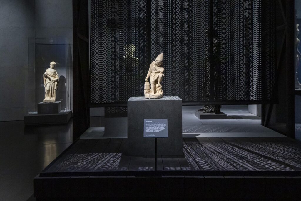
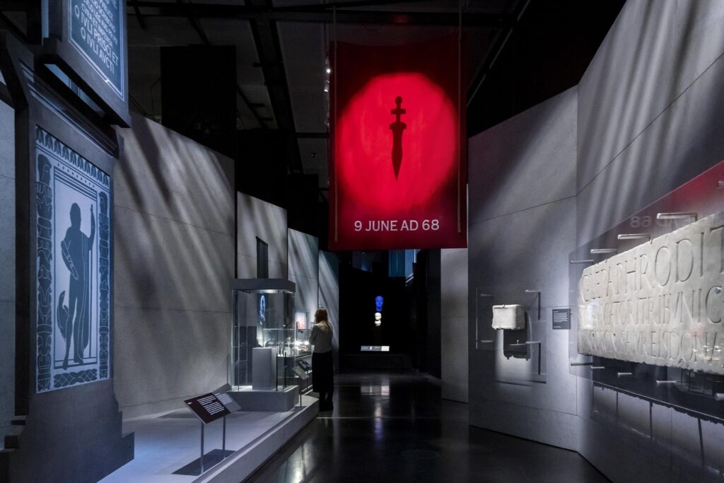
DHA worked closely with Drinkall Dean and Lombaert Studio to create a theatrical setting for this showman of the Roman world, including the use light projections, gobo textures and animated light sequences, with all objects beautifully and carefully lit.

Image by Edward Bishop

The exhibition is open now at the British Museum until 24th October 2021. Tickets may be booked through the British Museum’s website for the exhibition here.

Article: lighting mock-ups; intense work, but necessary

When creating bespoke lighting systems for display cases, then a physical mock-up – as intensive and time-consuming as it will be – is an absolutely necessity for the best results.

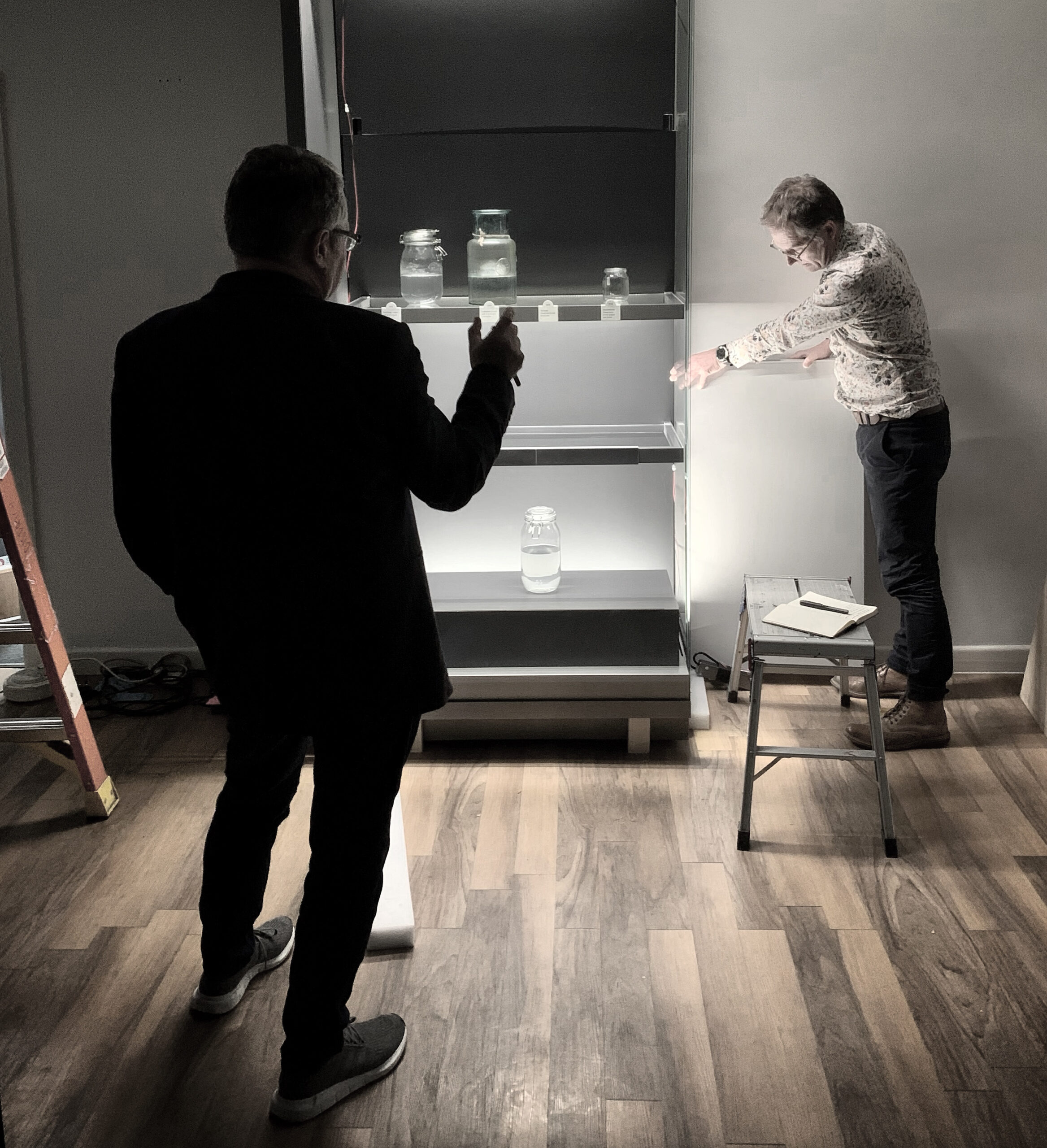
Jonathan Howard recently travelled – in a Covid-safe manner, naturally – with designers from Casson Mann to the factory of Click Netherfield in Livingston, just outside Edinburgh. The aim was to test and refine the lighting in some key display cases for a new museum, opening in London in 2022.

Not only will the cases be built mainly from glass, but the contents of each case will be a variety of samples and specimens, all displayed in liquid-filled glass jars: with so many reflective and refractive surfaces in use, it becomes easy to see why only a mock-up could cope with the many variables and methods in play: lighting all of the objects to give them a suitable weight and clarity when they need to be limited in light levels, while making sure that labels and graphics are very clearly illuminated is quite a feat of engineering and one that has been occupying us in the recent months.

Separation of light levels between graphics an objects has been developed using a combination of very narrow beam angle LED fixtures by Vexica, with a series of masking elements developed by Jonathan & Click’s designers, which has meant that we can achieve light levels of over 200 lux on a graphic that is merely millimetres from a shelf that is lit to a maximum of 50 lux; this separation will allow visitors to read small text easily, while not suffering with visual accommodation problems when they look past to the objects themselves, displayed at conservation light levels that will protect their organic content. As the source of the light is masked from view, we cut extraneous reflections and glare that could easily make the multiple glass and metal surfaces become their own light sources and a source of visual confusion.

The museum will not open until well into 2022, but this work needs to be carried out now to ensure that cases can be built in good time for transport and assembly on site, ready for the collection to be transferred to the finished gallery.

Tudors to Windsors: Royal British Portraits at the Maritime Museum now open

Our latest project: Royal British Portraits: Tudors to Windsors at the National Maritime Museum in Greenwich has opened to very positive reviews. The Evening Standard‘s reviewer gave the exhibition four stars and described it as an unsurpassed way of conveying what actually happened over half a millennium, which is quite a feat for a single exhibition. The space has been thoughtfully divided into spaces for each of the major royal dynasties that have shaped our history from the Tudors to our present royal family, the Windsors.

The Royal Central website described the experience as carefully curated & beautifully displayed, with lighting that is soft and unobtrusive: quite a complex task when were faced with monumental works such as the iconic portrait of Queen Victoria in full Empire pomp that occupied an entire wall, down to the tiniest of portrait miniatures, carried across Europe to contract royal marriages as a diplomatic tool as much as a love match.

Due to the sensitive nature of many of the works, including the most fragile of early photographic prints and miniatures painted on playing cards, our biggest challenge was to create a lighting environment that could give each piece an equal weight and clarity despite the enormous range of sizes, materials, colours and even framing in use throughout the exhibition: this included lighting a light box to assist in viewing contrast and coping with the most reflective of modern photographic prints that we have yet encountered.

Each section of the exhibition was given its own colour theme to give a visual key to the changes of dynasty, and as each colour responded to light in a different way, we had to carefully balance each section so that the visual appearance remained consistent while keeping the light levels to conservation-suitable levels; the full range of the museum’s lighting stock was pressed into service for the scheme and to protect some of the most delicate miniatures, a responsive lighting system was developed for two key display cases that respond to visitor presence, so that the miniatures are only lit when necessary.